Customized R Interaction Plots using Mplus Output
This vignette is to help those who:
- Use a Mac so they cannot create an interaction plot using Mplus, and
- Those who want to customize interaction plots using their Mplus output
Step 1: Create an interaction plot file in Mplus
Here is example code for doing this using a path model with skewed observed variables and missing data. This can be adapted to other analyses/models as well, see latent variable example here.
TITLE:	Interaction Plot;

DATA:	FILE IS data.csv; ! Load data

VARIABLE:
  NAMES ARE
    id pred mod out; ! Name variables in dataset

  USEVARIABLES ARE
    pred mod out; ! Choose variables that will be included in model

  Missing are all (-99); ! Specify what value indicates missing data
  idvariable = id; ! Specify which variable refers to participant ID if relevant

ANALYSIS: estimator = mlr; ! This specifies that the model will estimate sem model using full information maximum likelihood with robust standard errors

DEFINE: ! Standardize or center variables, then create an interaction term
  STANDARDIZE pred mod;
  pred_mod = pred*mod;

MODEL: ! Specify the model and label the predictor as b1, moderator as b2, and interaction as b3
  out on
	  pred (b1)
	  mod (b2)
	  pred_mod (b3)
	  ;

 pred mod pred_mod; ! Allow predictors to covary and estimate missing data

OUTPUT:
  TECH1 tech4;
  STANDARDIZED CINTERVAL;

MODEL CONSTRAINT: ! Specify your plot (here variables are standardized so 1 is equavalent to 1 SD)
  PLOT(lowmod highmod);
  LOOP(pred,-2,2,0.1); ! x-axis will show predictor between + and - 2 SDs at 0.1 increments
  lowmod = (b1+b3*(-1))*pred+b2*(-1); ! Plot line at 1 SD below the mean of the moderator
  highmod = (b1+b3*(+1))*pred+b2*(+1); ! Plot line at 1 SD above the mean of the moderator

PLOT: TYPE IS PLOT2;
Running this code should automatically create a .gh5 file in the folder your code is saved.
Step 2: Load source code file into R
- Download this file from Mplus I’ve edited to allow more plot customizations: mplus2023.r (download button is in top right corner)
- Open R
- In the “Code” dropdown menu from the toolbar, select “Source File…”
- Choose the mplus2023.r file
Step 3: Plot your graph
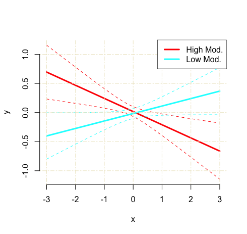
Use the “mplus.plot.loop” function to create your graph: provide the .gh5 file created from Mplus and the names of the plot lines you created for low and high moderation values.
mplus.plot.loop('/Location/filename.gh5',
	c("lowmod", "highmod")
	)
This should spit out a graph that looks like this:
Step 4: Customize your graph
To add a title use title and grid lines can be toggled on via showgrid (options: T or F)
For the axes:
- Add axis labels to your plot with
ylabandxlab - The limits of the y-axis can be set with
ylim - Changing the x-axis limits requires altering the Mplus syntax:
LOOP(pred,-2,2,0.1)
For the legend:
- Alter the legend text use
leg.txt - Move legend location use
leg.loc(options: “top”, “topleft”, “topright”, “bottom”, “bottomleft”, “bottomright”) - Change the size of the text use
leg.cex - Set the colour of the legend box border
leg.b.col
For the lines:
- Change line width with
lwid - Confidence interval line types with
linetypes(options: “blank”, “solid”, “dashed”,“dotted”, “dotdash”, “longdash”, “twodash”). You can also specify a number here to fully control the line gaps (e.g., c(“24”,”24”) or c(“1223”,”1223”))
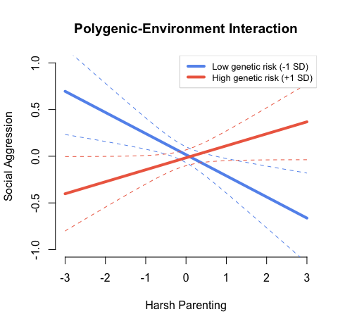
mplus.plot.loop('/Users/Location/filename.gh5',
		c("lowmod", "highmod"),
		title = "Polygenic-Environment Interaction", # Plot title
		ylab = "Social Aggression", # y-axis label
		xlab = "Harsh Parenting", # x-axis label
		ylim = c(-1,1), # y-axis value limits
		leg.txt = c("Low genetic risk (-1 SD)","High genetic risk (+1 SD)"), # Legend caption labels
		leg.loc="topright", # Location of the legend
		leg.cex = .8, # Size of legend text
		leg.b.col = "lightgray", # Colour of legend box outline
		linecolors = c("cornflowerblue","coral2"), # Color of regression lines
		lwid = 4, # Regression lines width
		linetype = c("dashed","dashed") # line type for confidence interval lines (“blank”, “solid”, “dashed”,“dotted”, “dotdash”, “longdash”, “twodash”)
		showgrid = F, # Show grid lines (T or F)
                )
These specifications should create a plot that looks like this:
Author: Erinn Acland